The reason why I chose architecture is because it is very eye please and interesting to look at. There is one type of photo that you can take with architecture because it loads of things. You can take a picture linked to architecture and it can be any colour or shaped it will still be interesting to look at or work on. Personally I like to take pictures of the different shapes and colours/reflections on buildings, because even though the photos are really simple there are loads of different things to look at and analyse. by the end of the project I would like to make a collage or book with all of my photos in it.
Margaret Stratton is a architecture photographer normally takes photos of buildings and also photoshop them to make the look abstract. she doesn't only take photos of buildings she also takes pictures of small objects and make them look abstract. all of her photos are taken in black and white to make them look more effective. another thing that she is interested in is video making.
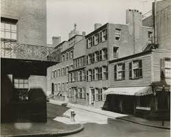
Berenice abbott photographs are also in black and white but her pictures are a lot more fun and creative compared to Margarets pictures. for example there are more people and different buildings in the pictures. they are all in completely different perspectives as well. None of the photos look the same and she has made it easy for people to talk/think a lot about her photos.
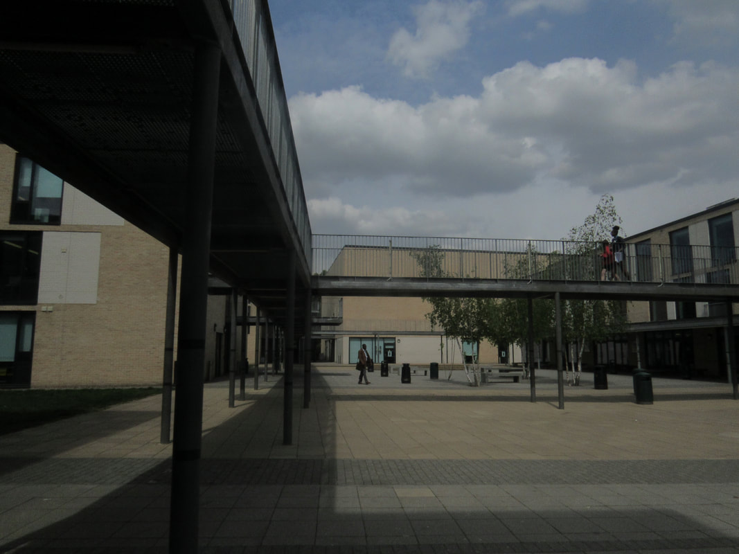
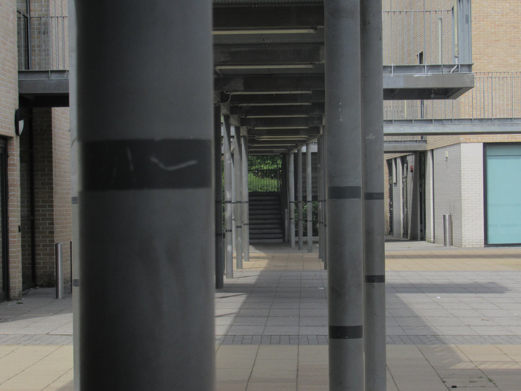
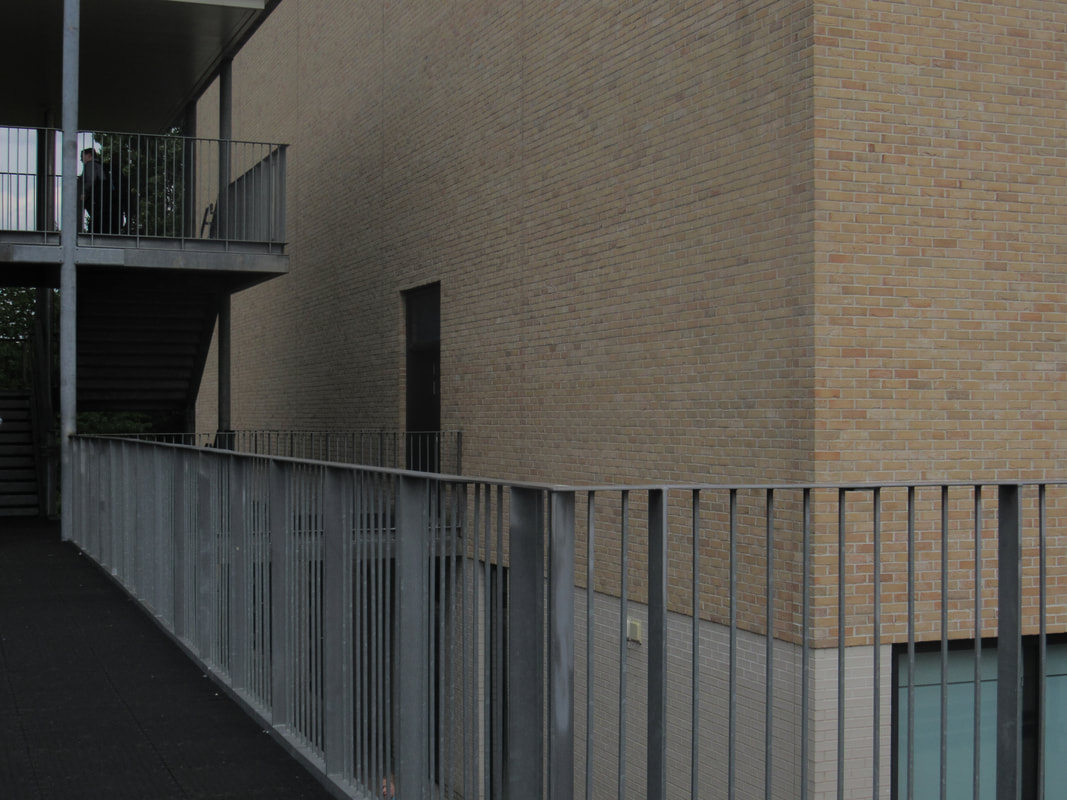
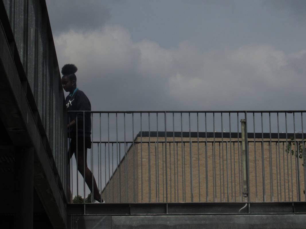
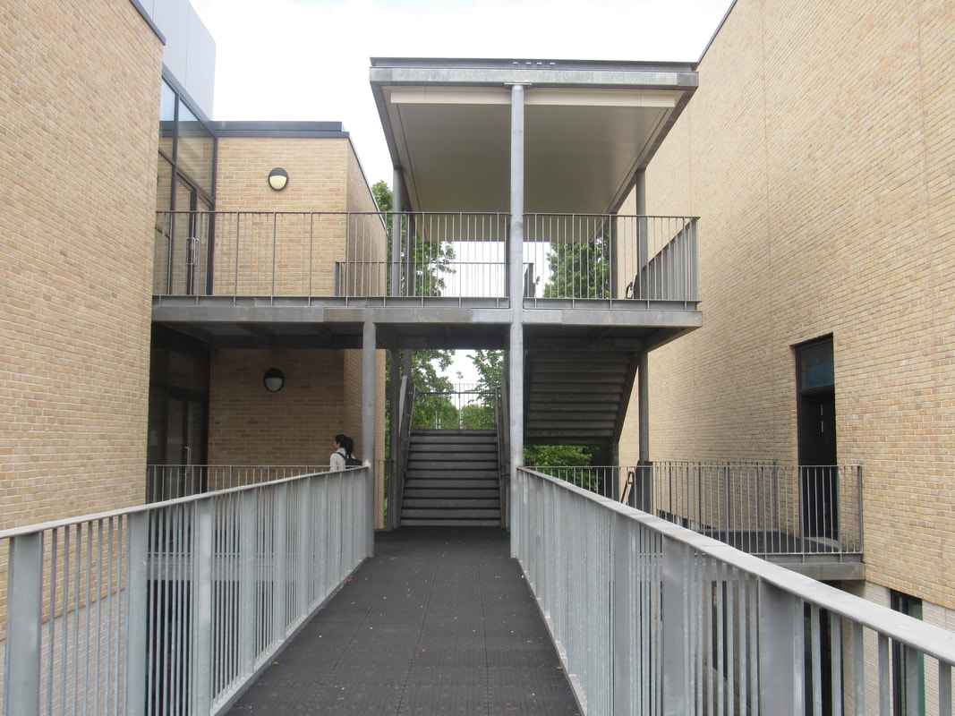
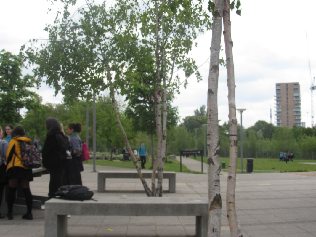
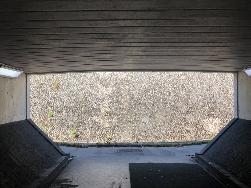
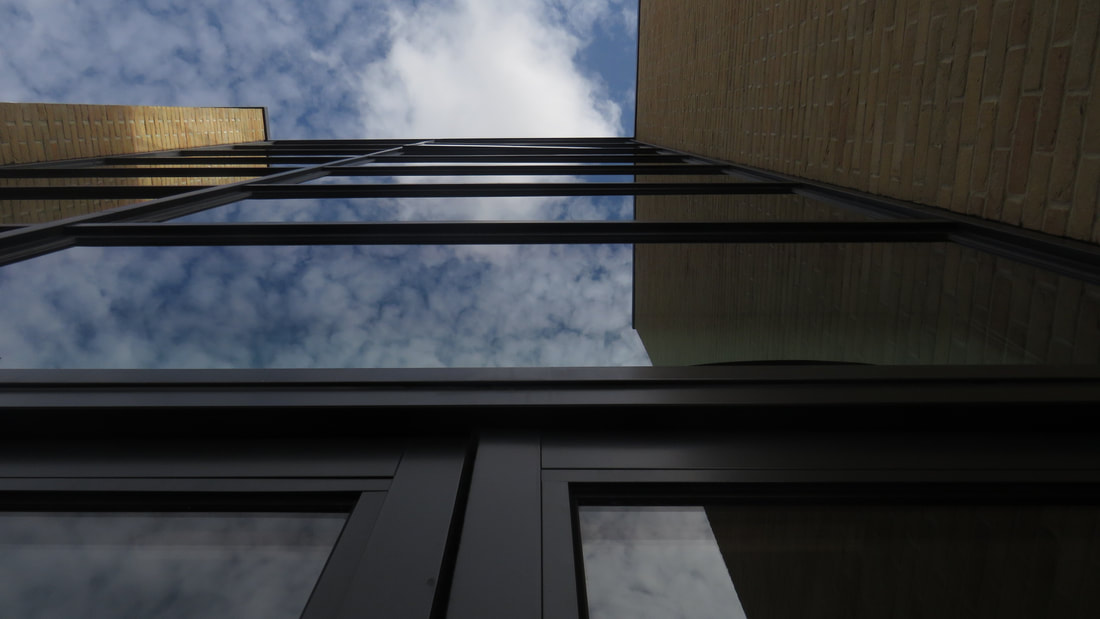
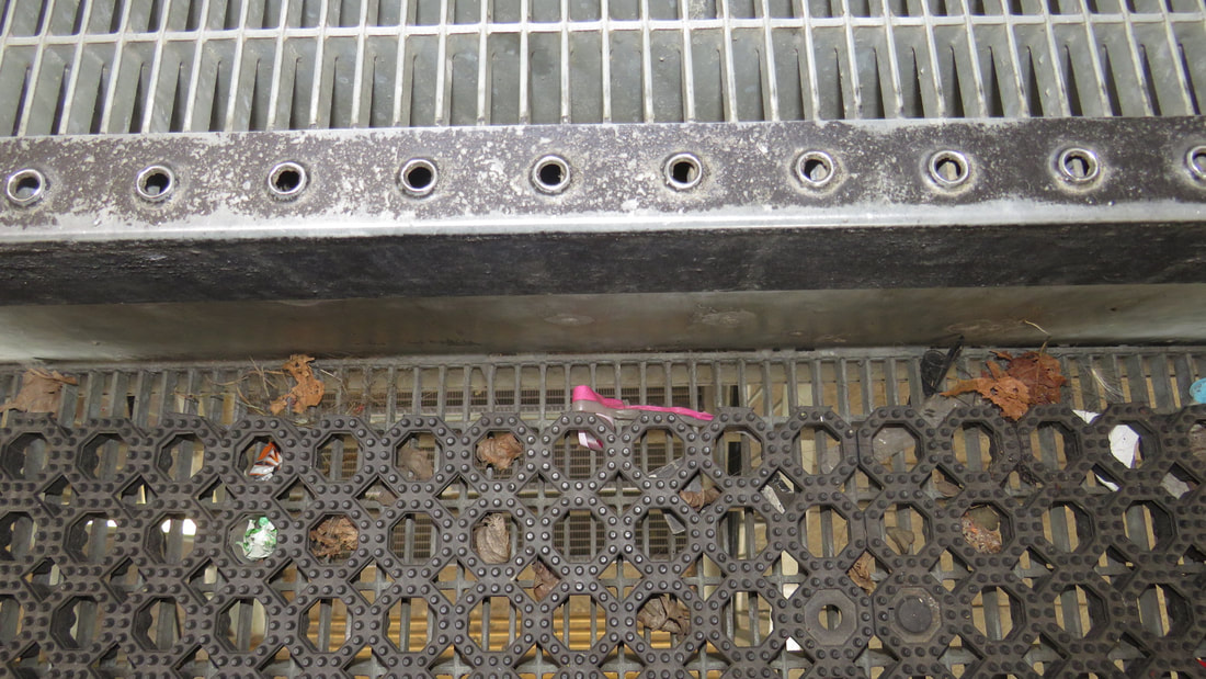
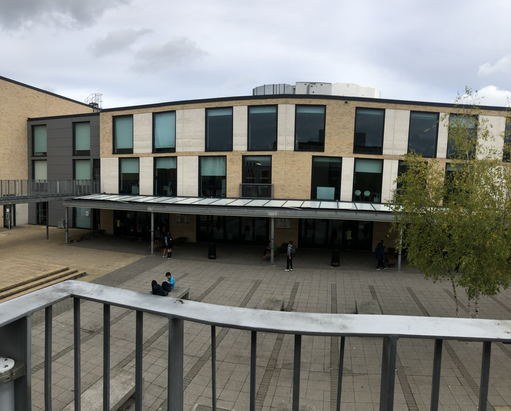
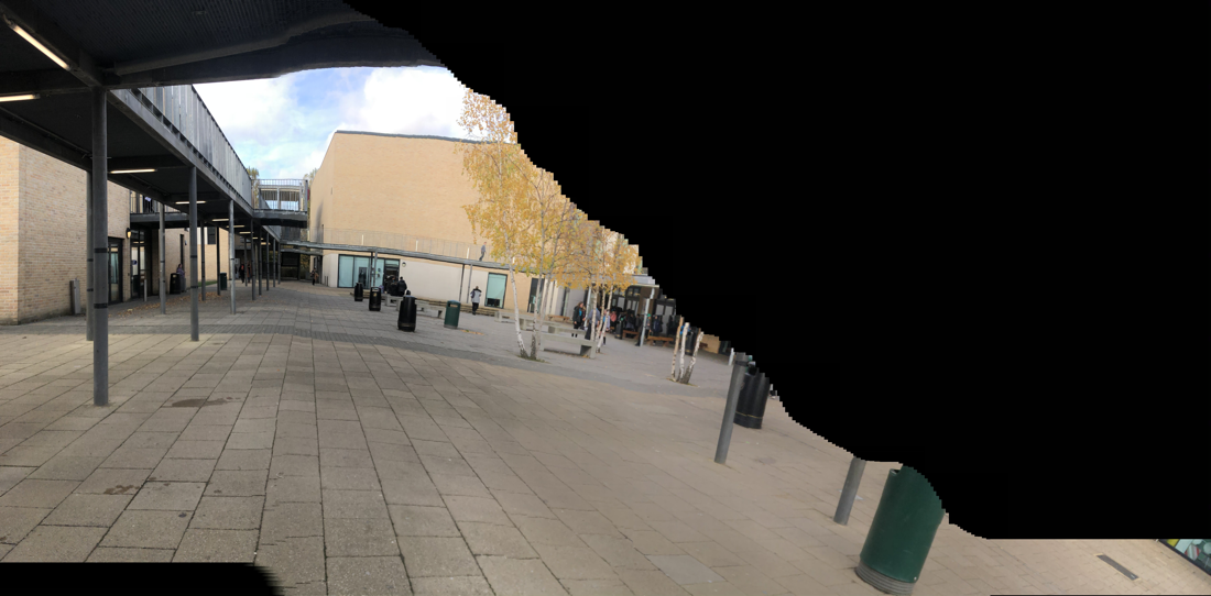
These set of photos where all focused on the different shapes and lines created by the walk way. They are good but not what I was trying to create. they are all very similar but feature very different things. I think I could have made the photos a little bit different by finding other things that related to each other, instead of taken a photo of the same thing but in different places.
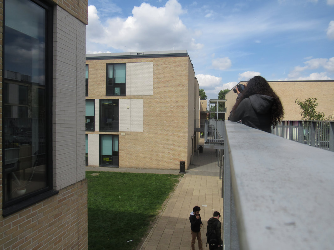
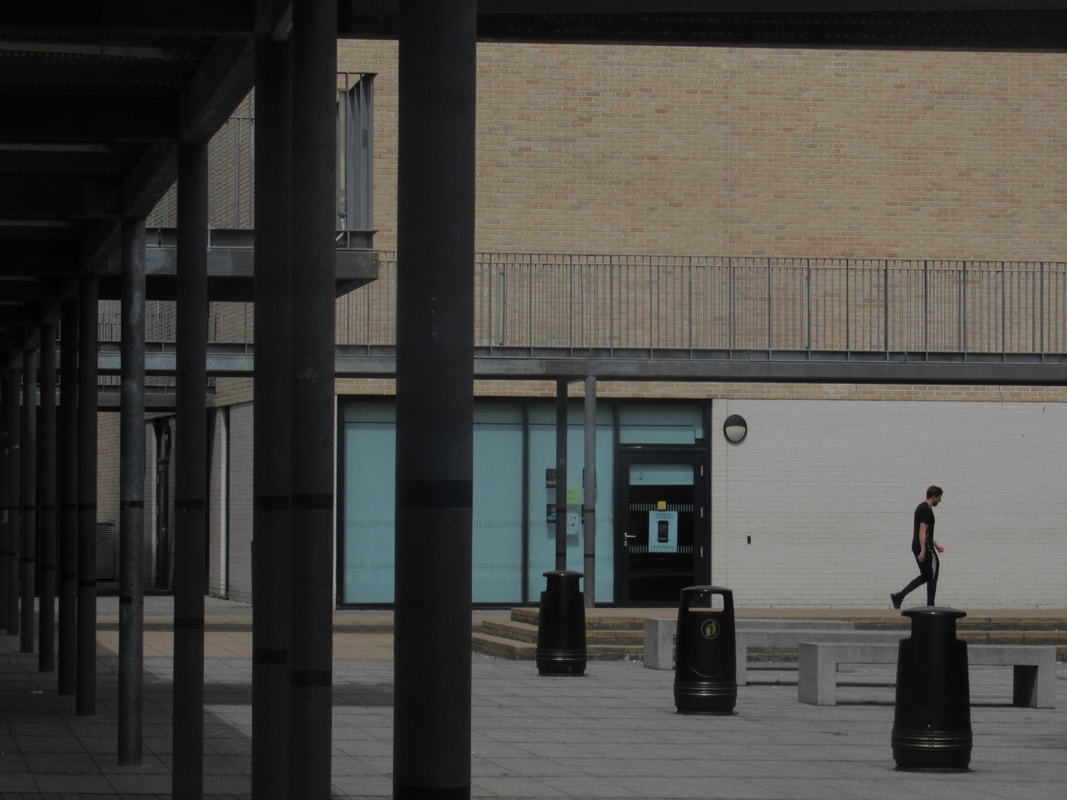
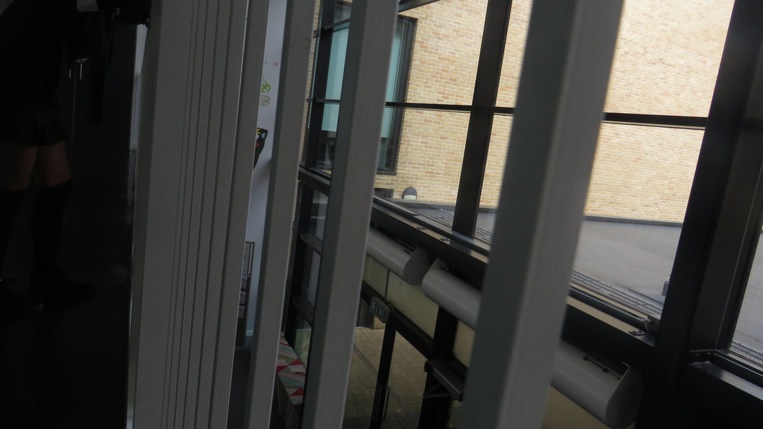
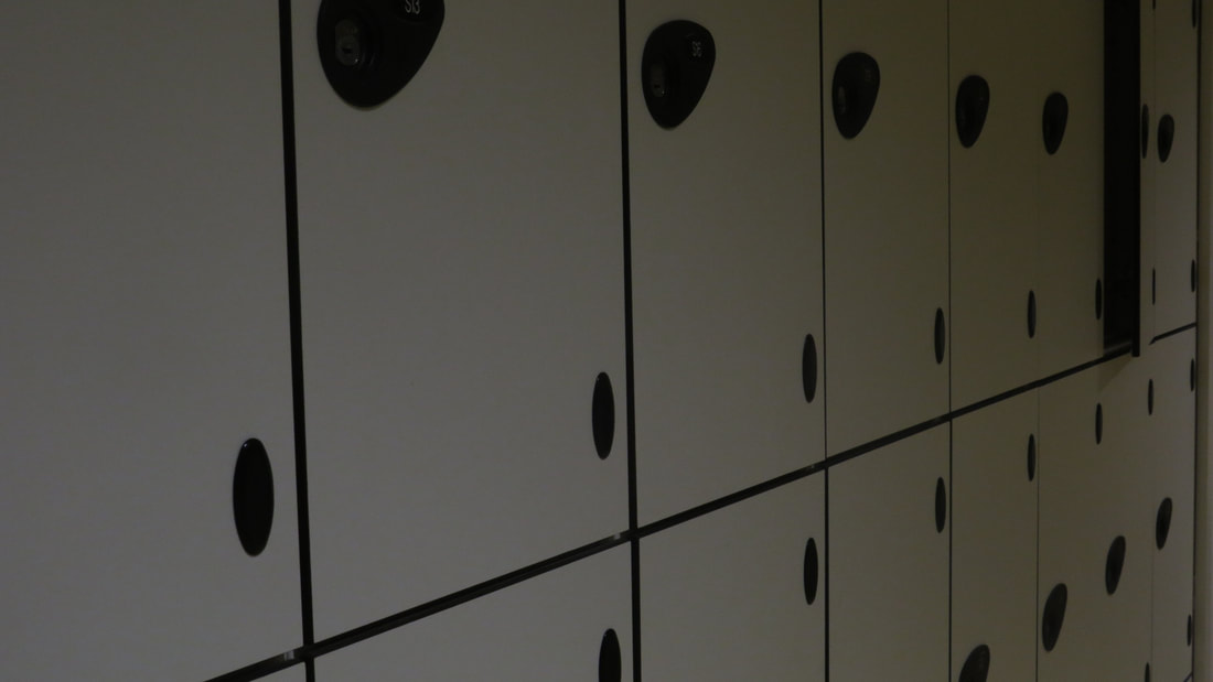
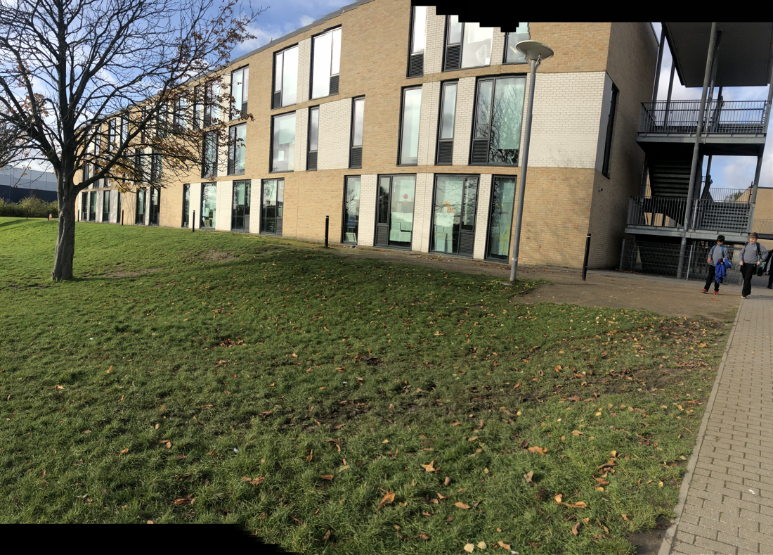
I don't think that these second group of photos worked out very well, there isn't a main focus, so they are all very messy and random. the thing that I think did go well was the photos are all very different and bring out loads of different things in them. for example the shapes in the buildings and interesting to look at and the way that everything is formatted in the surrounding.I think that the photos without people in them are a lot bolder than the ones with people in them. I also think that its easier to focus and identify the architecture in the photos. Compared to the first set of photos I think there is a lot more to focus on in these photos and the series of lines and shapes are a lot more interesting.
Architecture essay
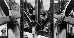
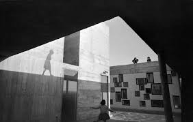
The reason why I chose this as my project is because this is intresting to take photos off, in this photo I see lots of shapes and abstract building and the building are all over lapping each other which makes the photo look a lot more interesting.
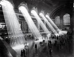
You can see loads of different shadows from people. This is abstract because the shapes of the shadows are different to any other types of shadows you would normally see, in architecture photos and everything is placed in such random places of the pictures.
This photo is 3D because all the abstract shape stick out. The part that sticks out the most to me is on the left side of the image where you can see the shadow of a child walking on top of the building, this stands out the most because you don't actually know what the child is doing or if it is even a child, you have to imagine and create a 'story' in your head about what might be going on.
If I got to choose what I named this image I would call it shapes, the reason why I would name it this is because the main focus of the photo. for example the things that catch your eyes most are the shapes of the shadows that are reflecting off of the buildings. and the way that all of the shapes come together to make a big colarge of shapes.
I think the artist took this photo because of the framing and the perfect timing and shadows. everything is so precise and it all fits in together.
One thing that I think doesn't go that well in this photo is the lack of colour, I think that if he had colour then it would make things stand out a little more and you will be able to see the little details a little better when looking at it. but not having colour also makes the photo very bold and helps it stand out more.
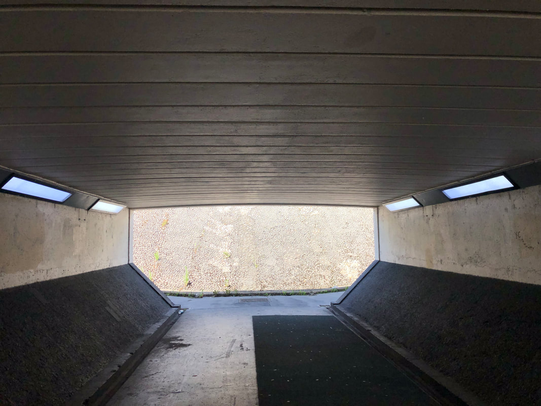
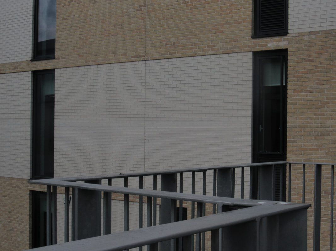
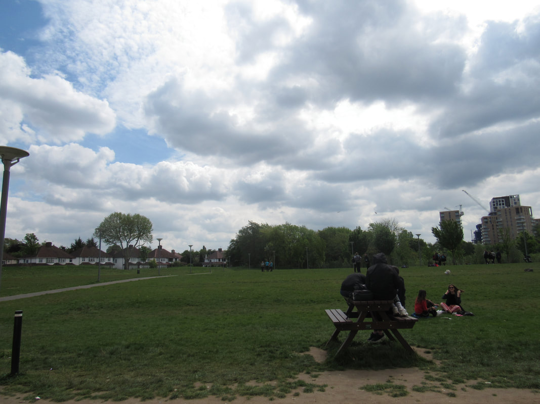
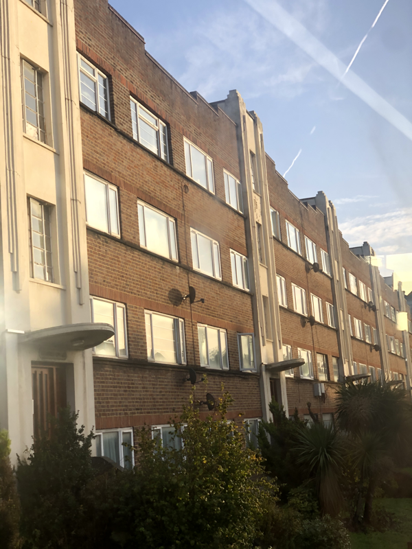
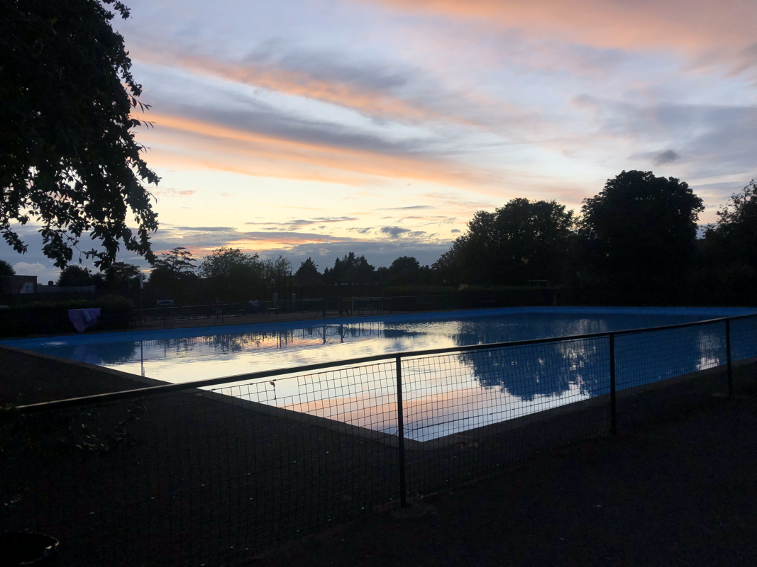
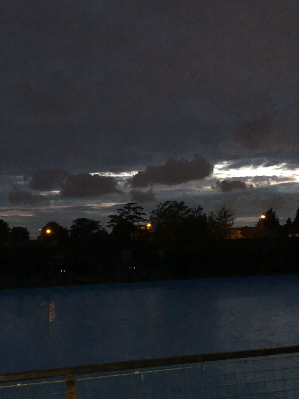
These are the photos that I took outside of school that caught my eye. I thought they were very abstract and different. All three pictures are very and dont have a lot of different colours but I think that they all have a lot of focuses. For example, the bridges are very dull and empty but you could talk about all of the different shapes that is made by it. Also the photos aren't very bright coloured but are very detailed and different.
In school project
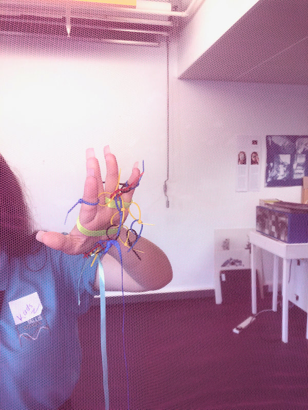
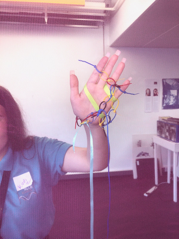
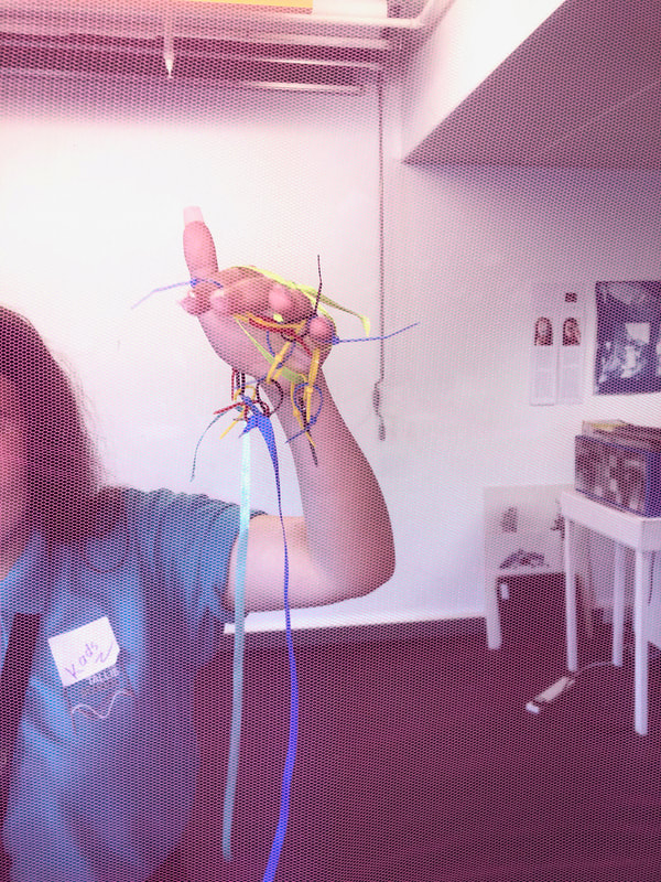
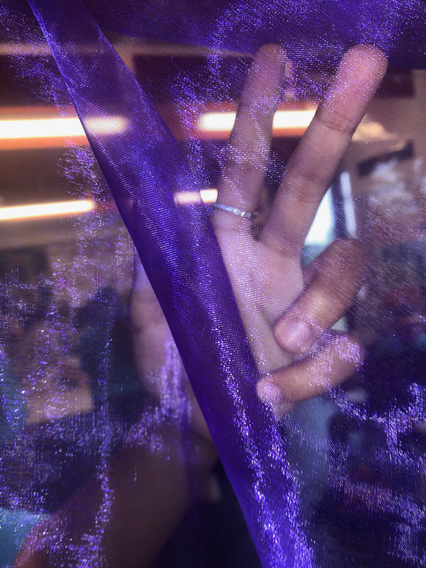
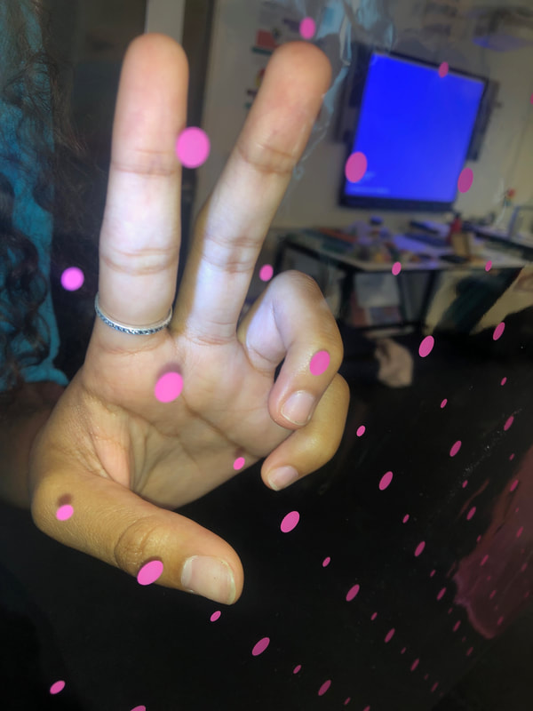
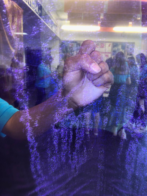
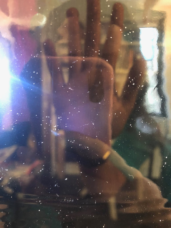
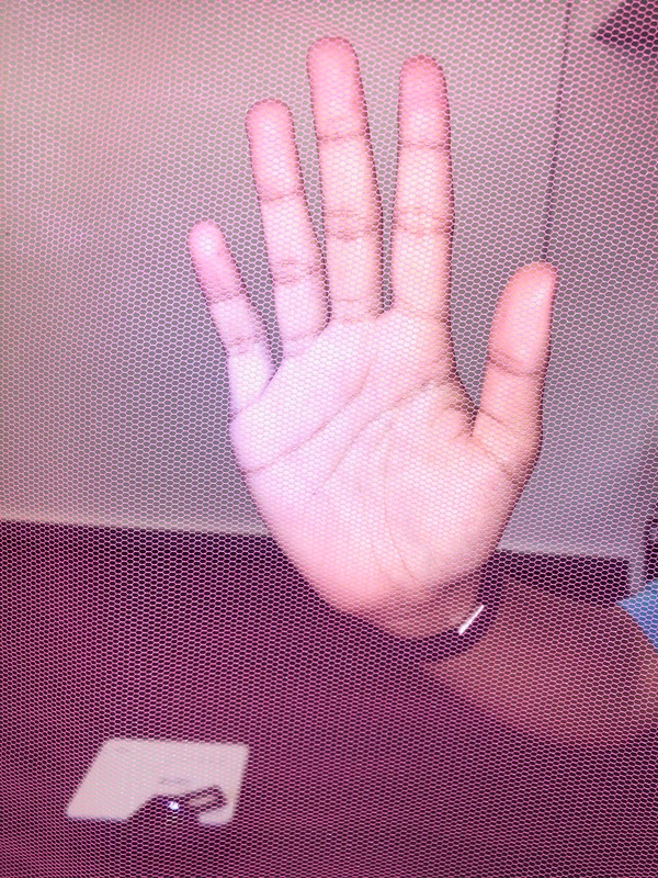
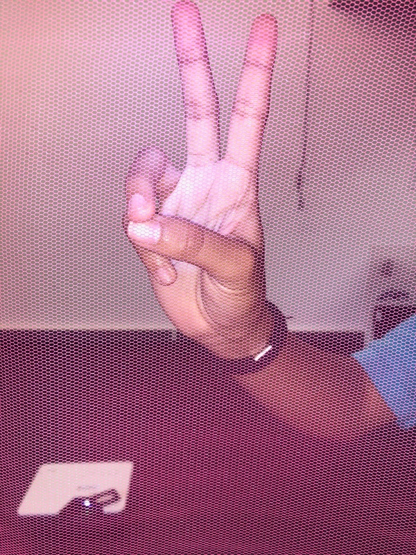
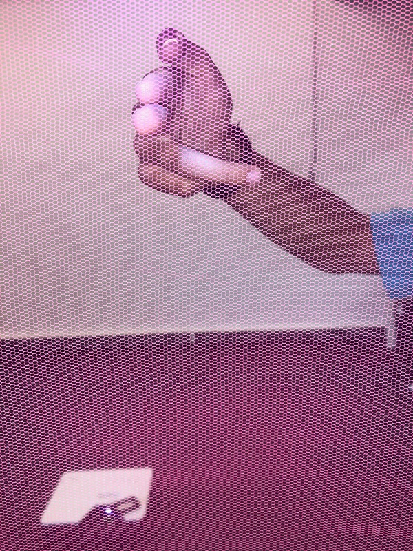
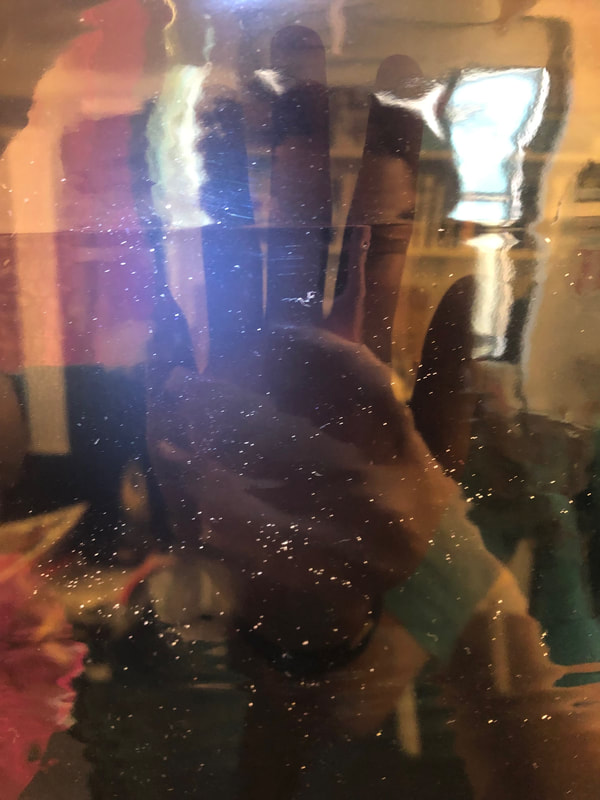
These images was taken when we had a lady come in called lucy who done a project called leap and look with us. we had to take photos using different fabrics and objects that we made, in loads of abstract ways. for example we took photos and videos of our hands behind different colours fabrics, and done different movements behind them. I enjoyed doing this project, because it was something different to do and it was good to get some different style of pictures compared to the other previous pictures I took.
|
|
|
|
|
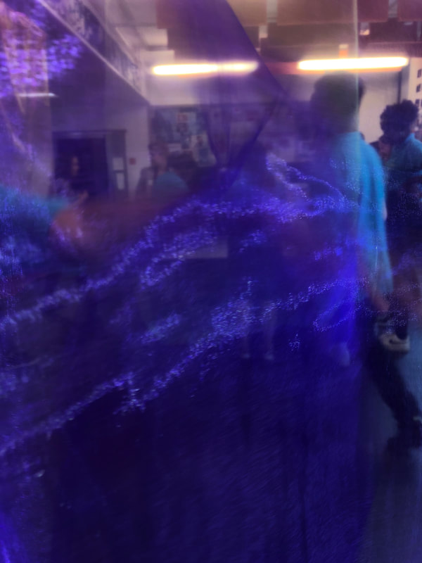
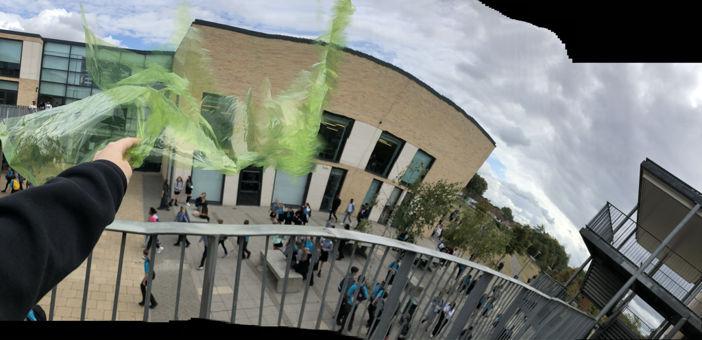
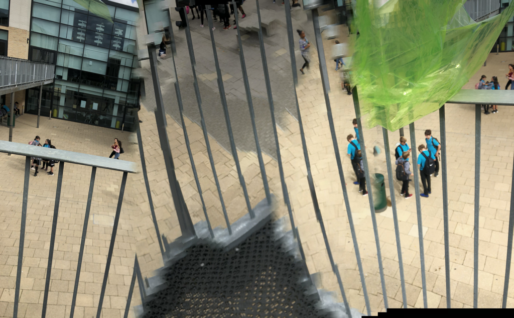
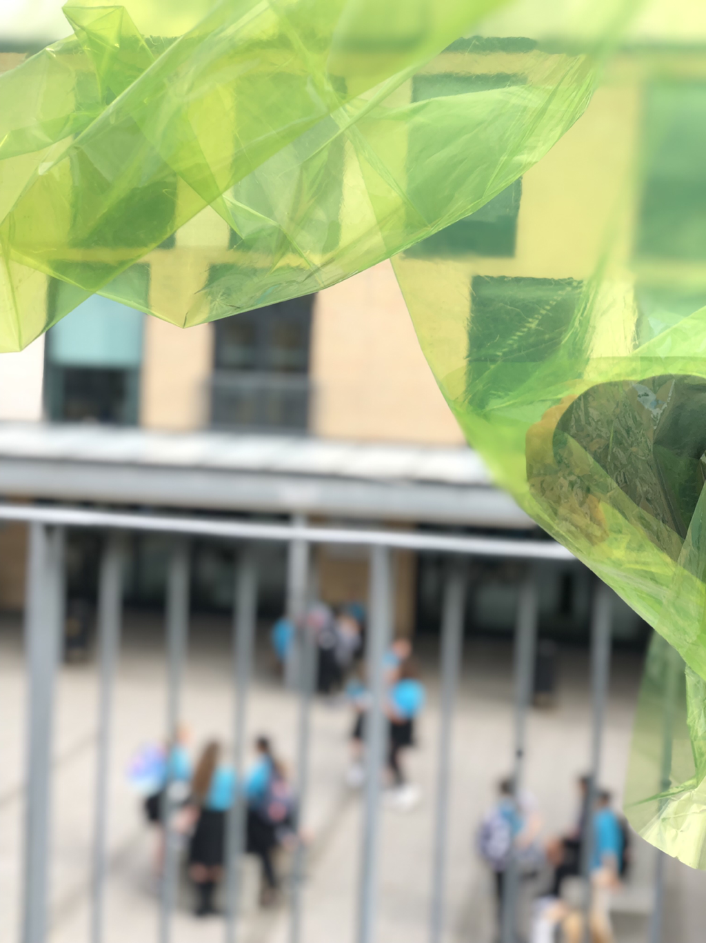
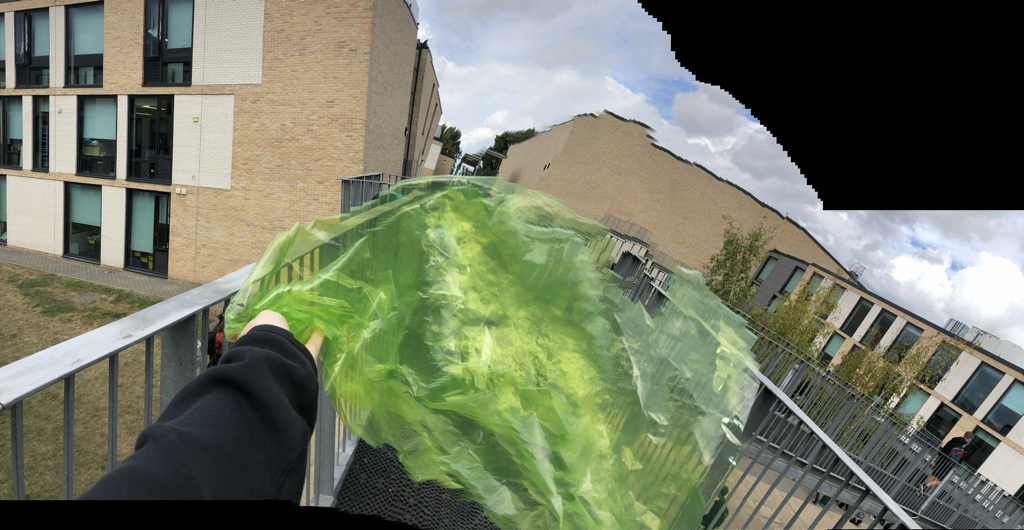
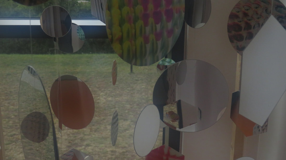
These pictures are pictures that I took with an app on my phone. I used green assitate to take my photos with, which made my photos look more interesting and developed. some of there photos didn't come out completely developed and look 'wrong' but I think that it looks more effective that way. there is a lot more to focus on in the wrong photos as the app on my phone created its on shapes/lines.

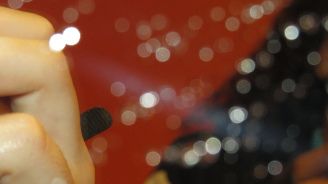
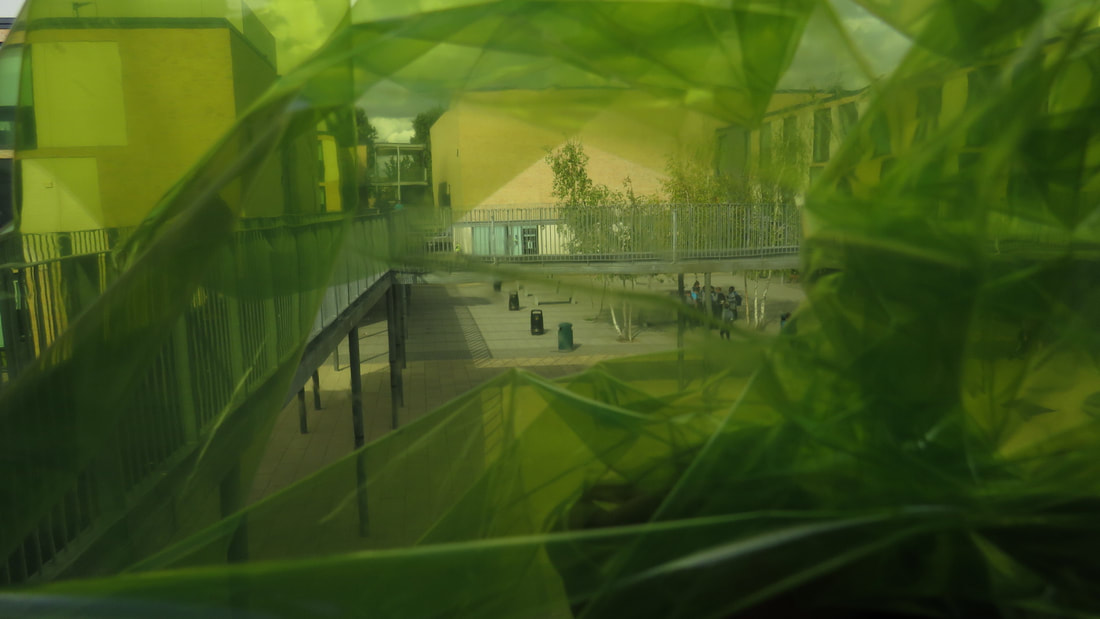
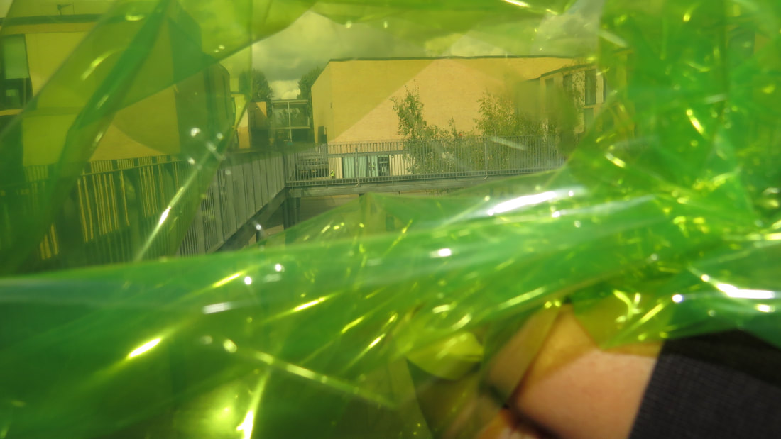
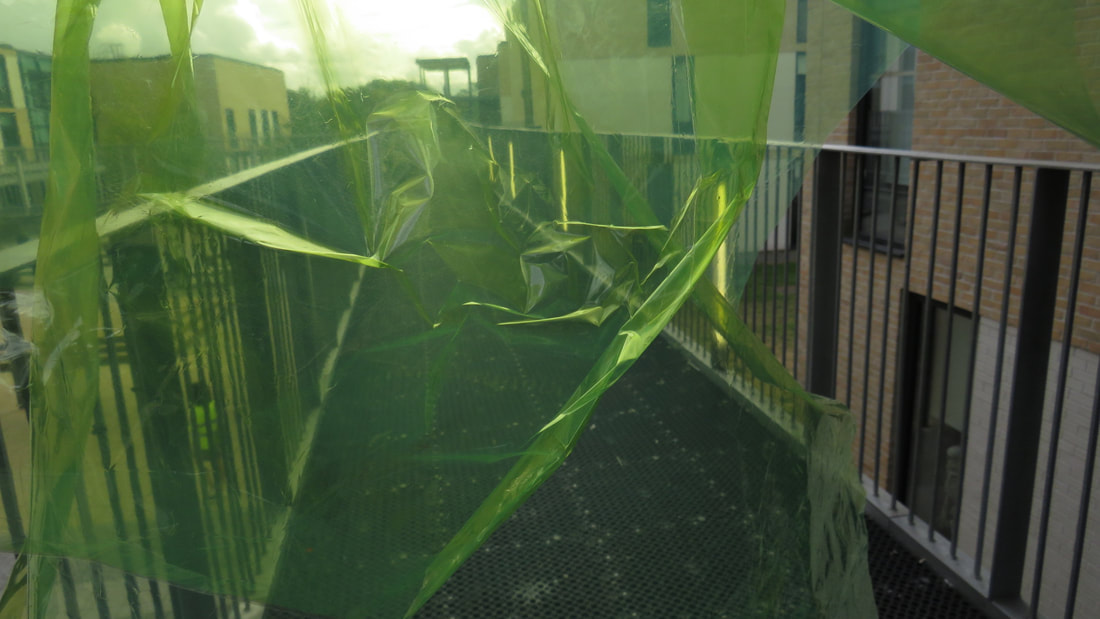
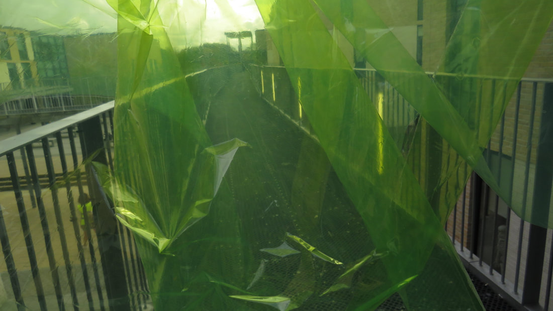
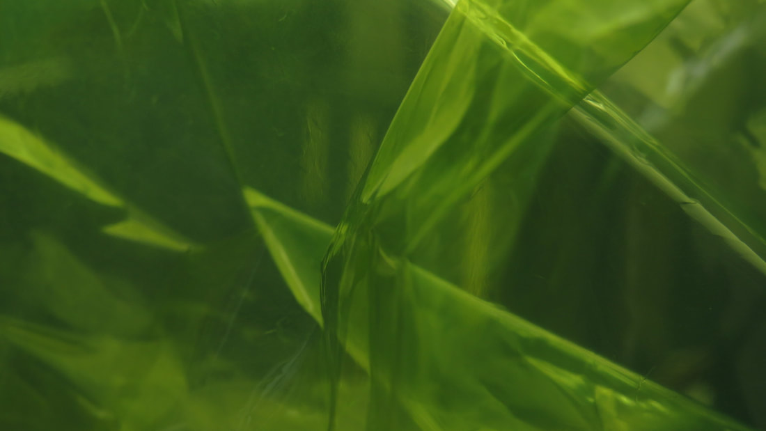
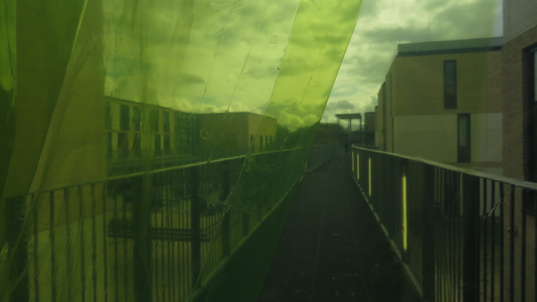
These imagines are some of the images that took using the portrait filter on my phone. The filter make the photo stand out more by focussing on one part of the image and making all the surrounding blurred. I prefer to use this filter because it makes my photos more abstracts and different to other peoples. These set of photos are just things that I was experimenting on, so they are all very different and mixed up. My favourite photos are the ones with the green acetate in them because they are different to any of my other photos and the focuses are very bold, which makes the photo very eye pleasing.
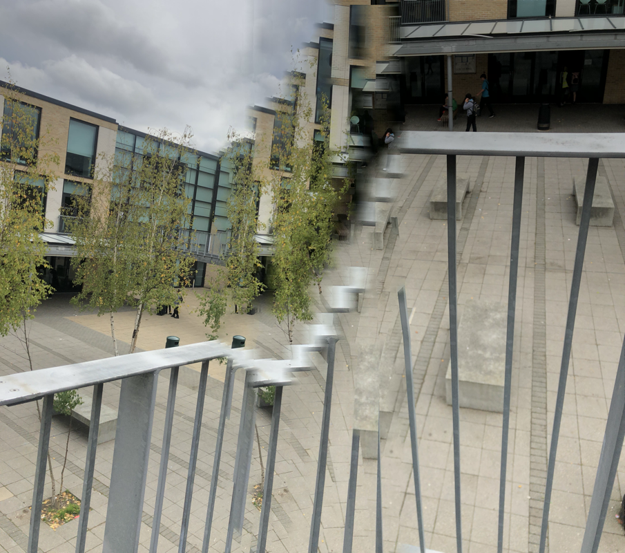
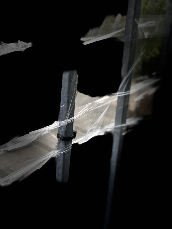
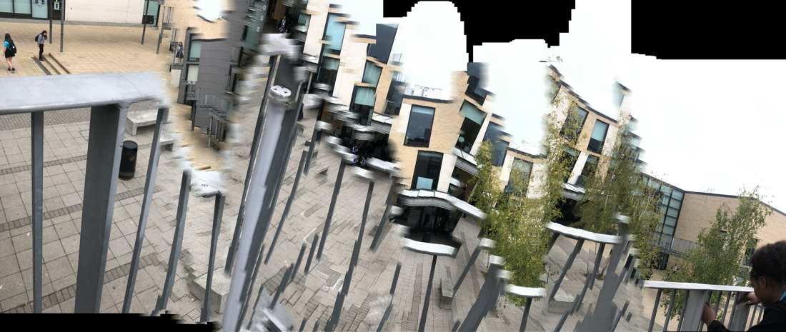
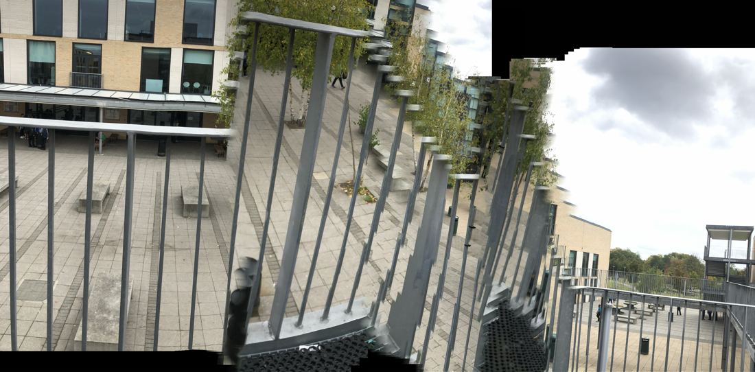
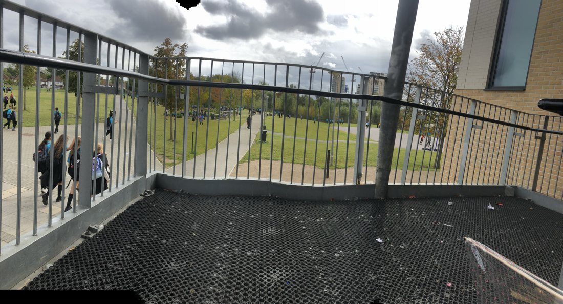
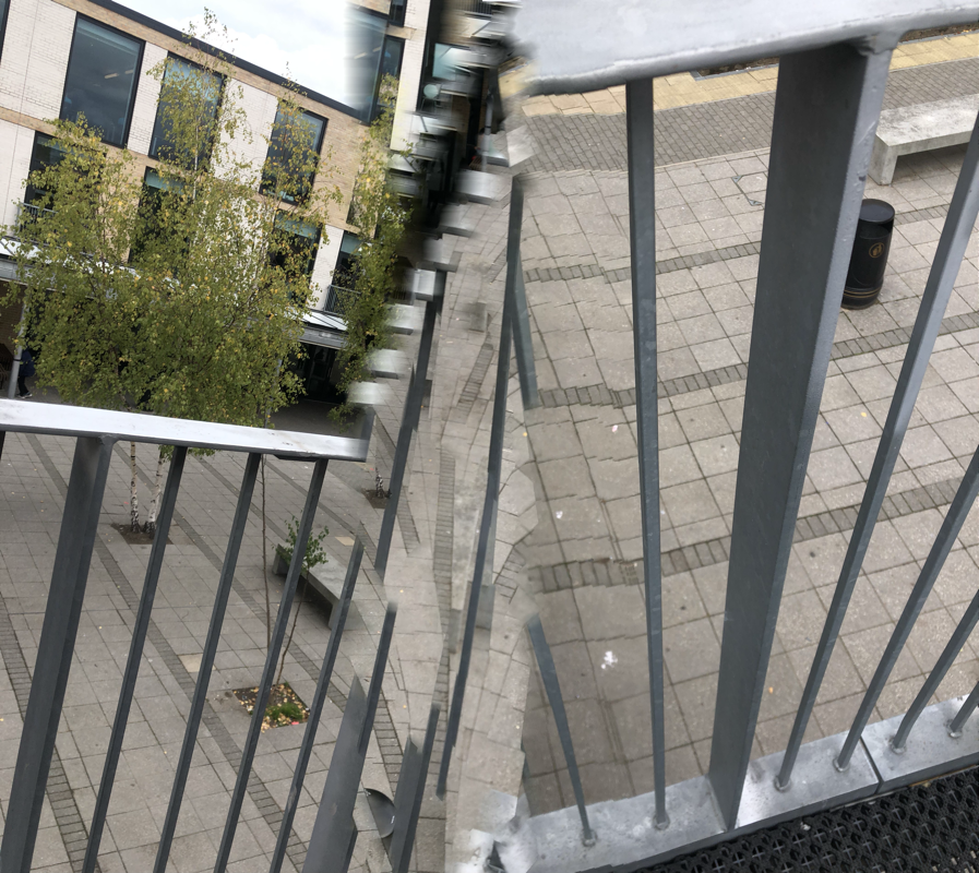
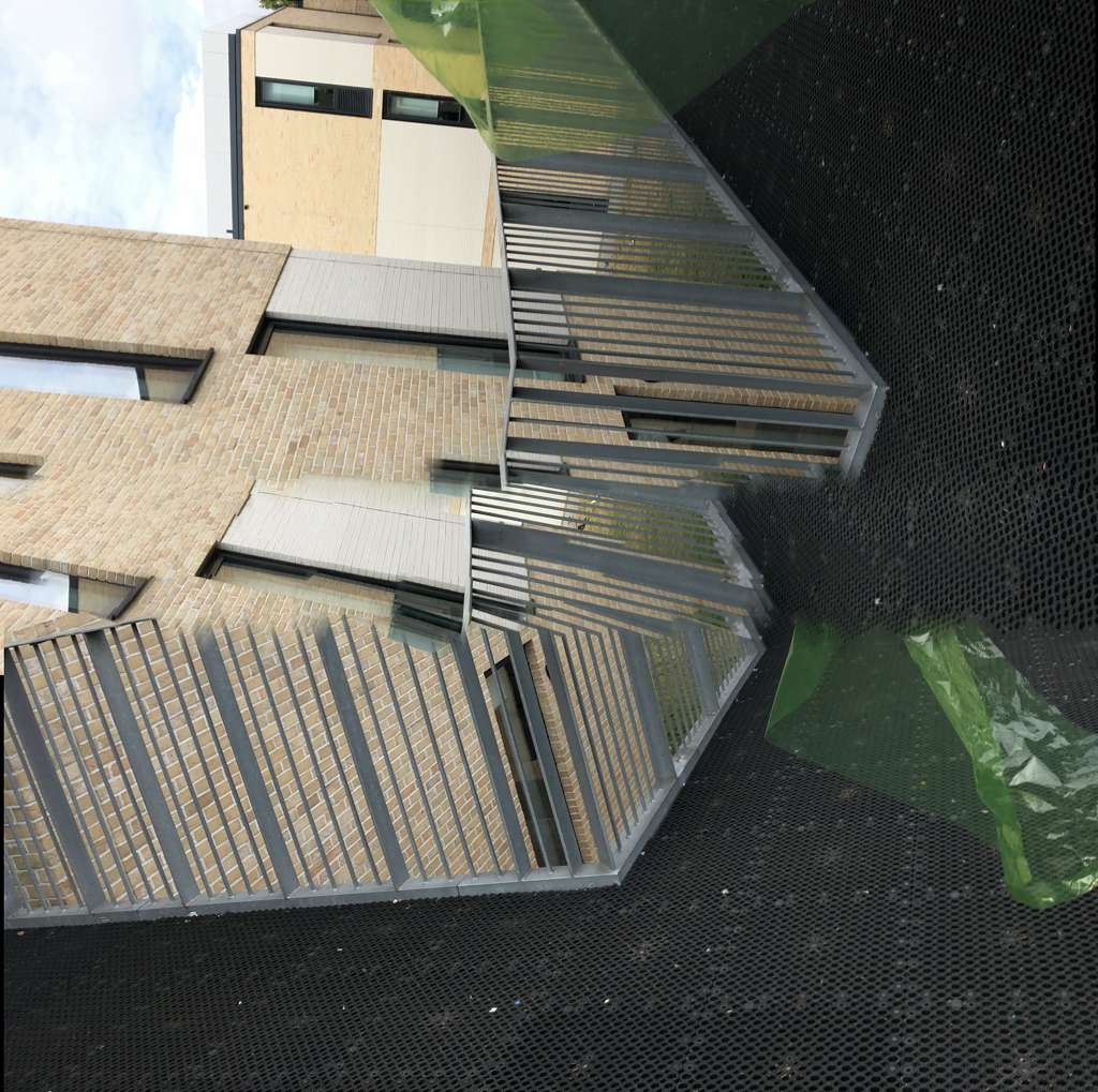
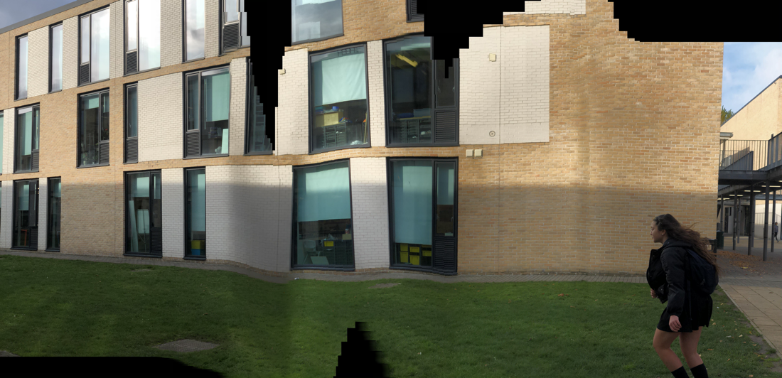
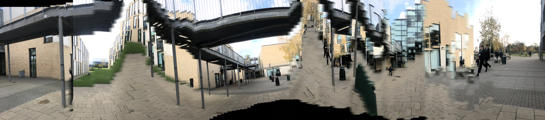
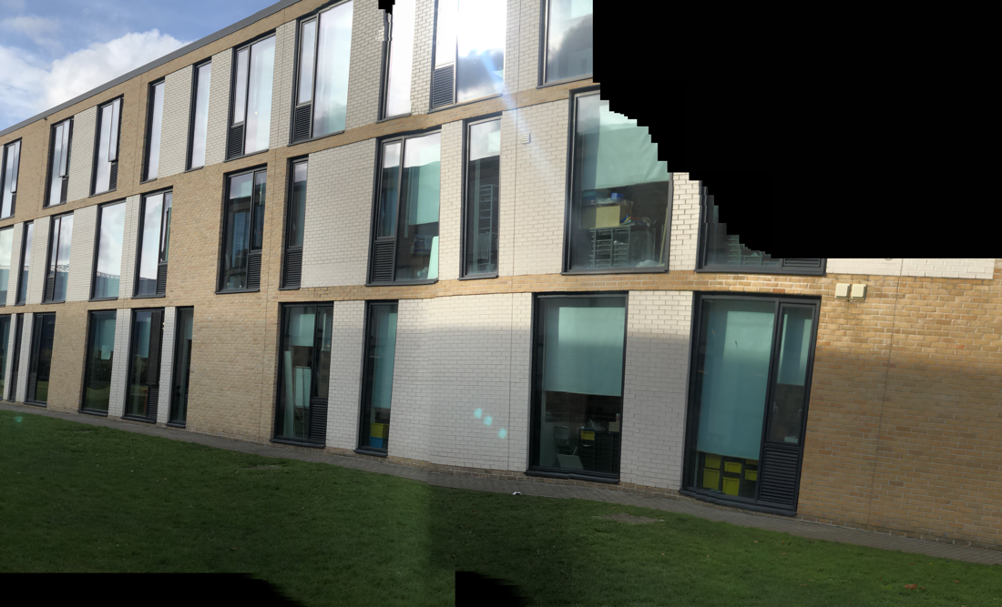
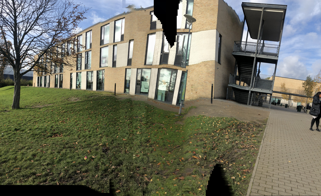
These are the second group of photo that I took. They where all taken on the pano filter on my phone, I like these set of photos because they are unique and don't look like any of my other photos on my website. the photo that I like the masts the photo of the railing that looks like its covered in black inc, the reason that I like this photo is because even though it didn't turn out how I wanted it to and went wrong it is still different and makes you think hard about what the photo could be.
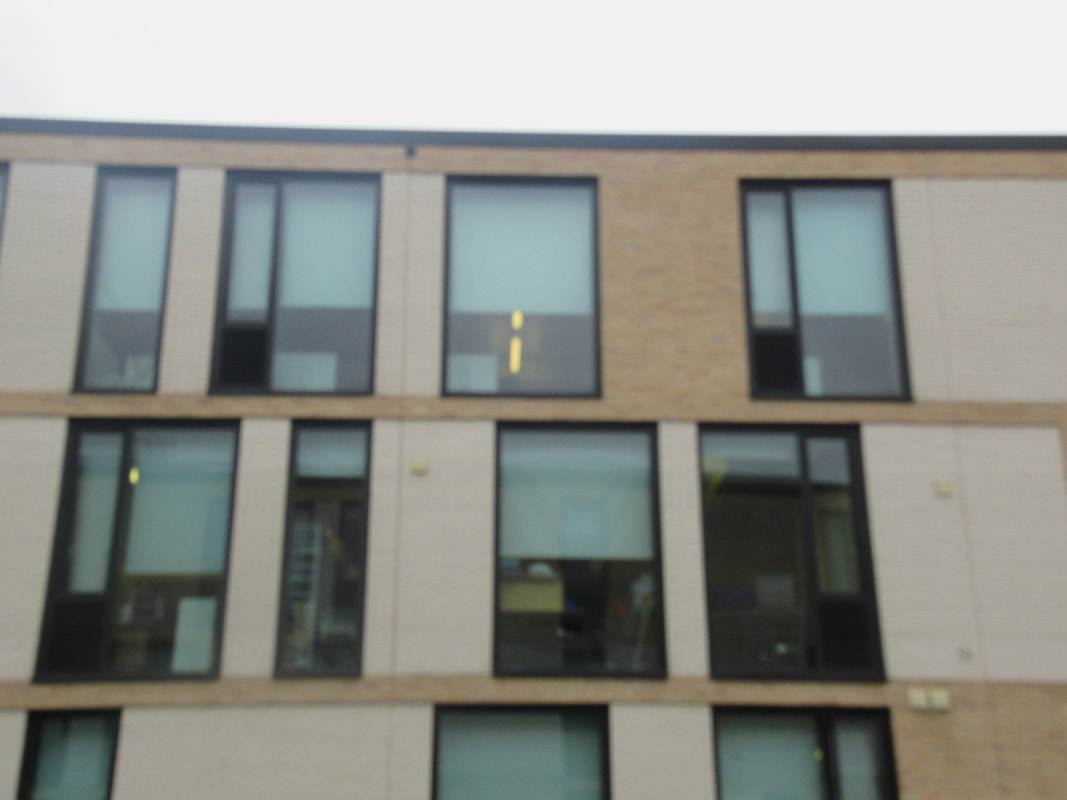
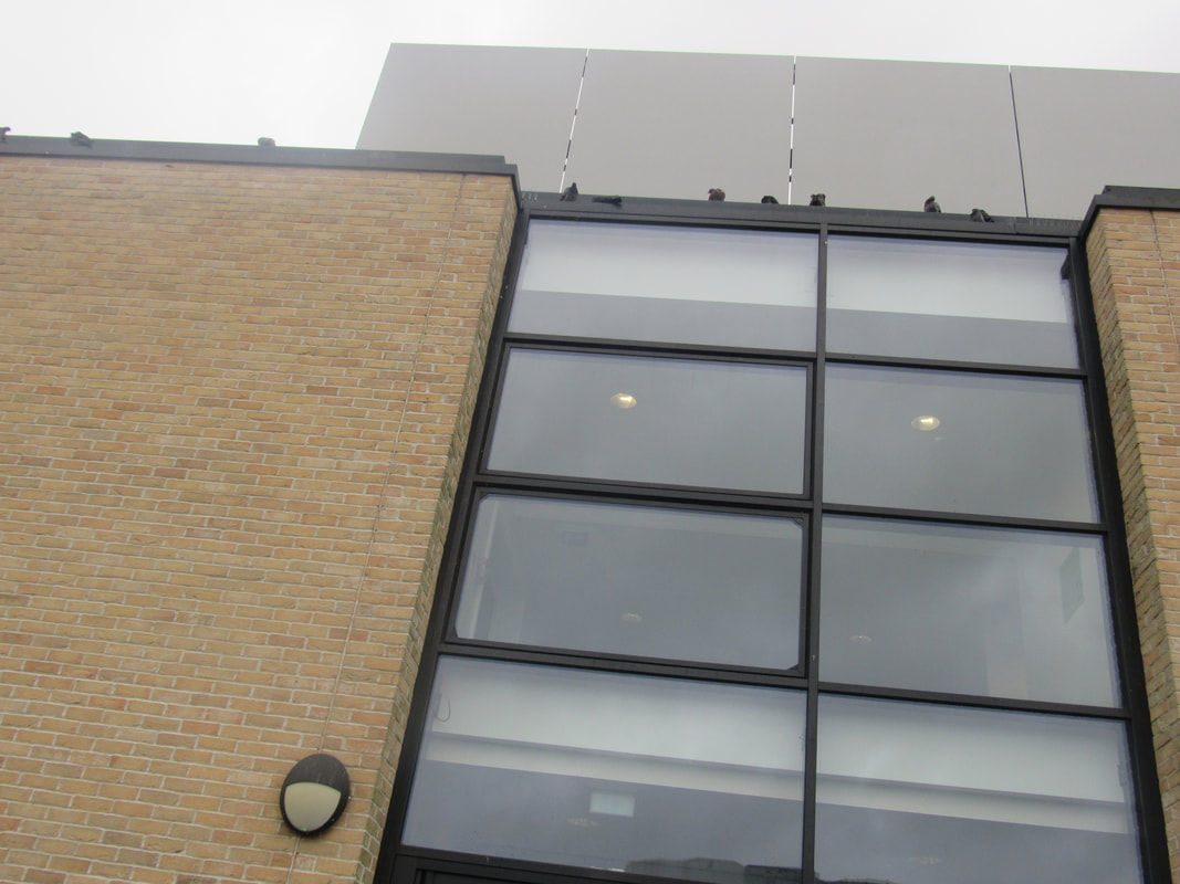
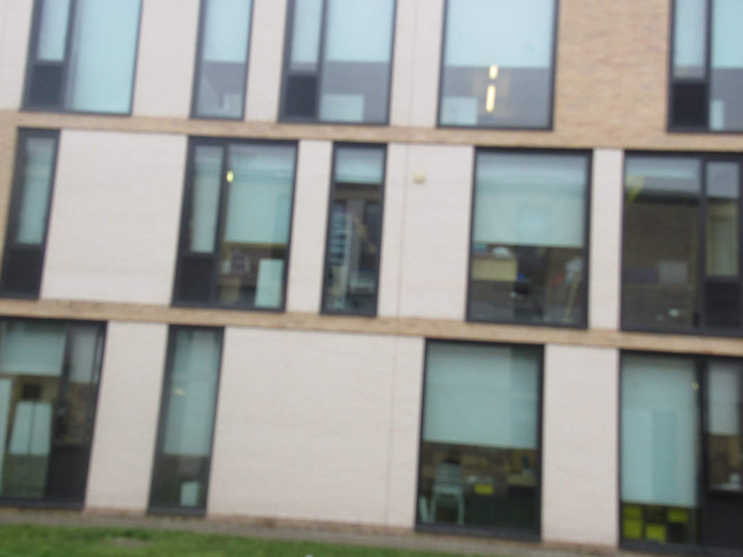
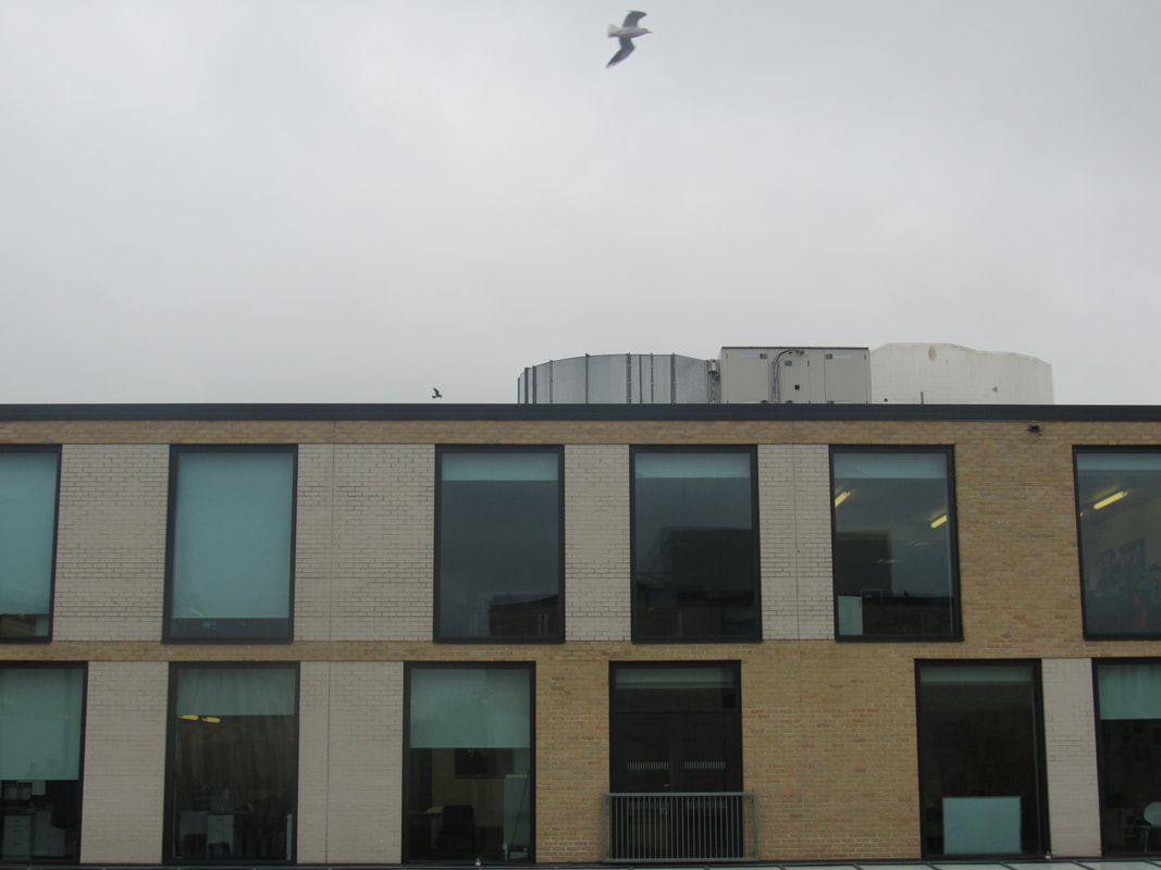
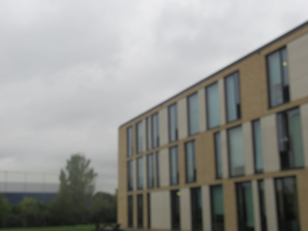
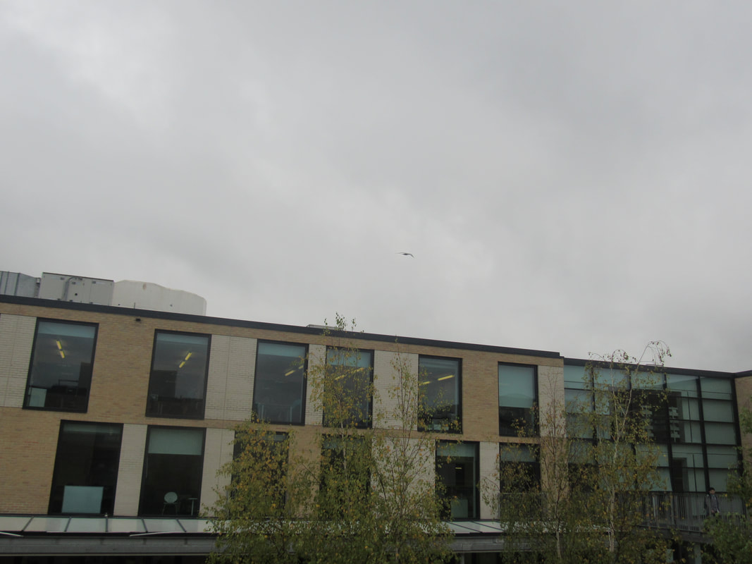
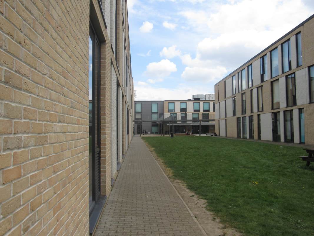
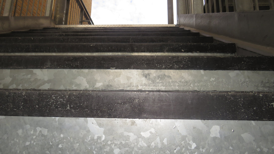
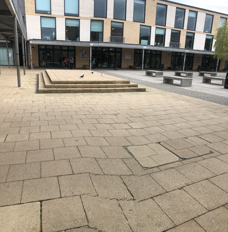
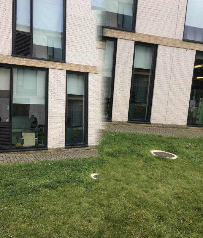
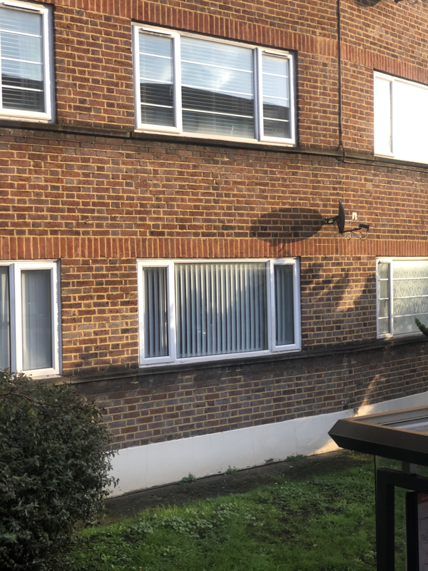
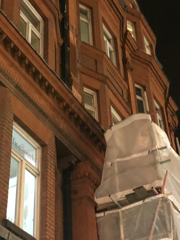
In these set of photos I was trying to focus on only the tops of the buildings, the reason I done this is because in my other photos there are to many things going on which makes it hard to find a main focus. I like these set of photos because they are all similar. you can have two different perspectives on these photos for example you can look at them and thing that they are boring and all the same, or you could look at them and find a lot to look at.
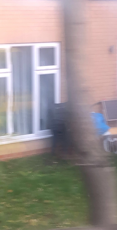
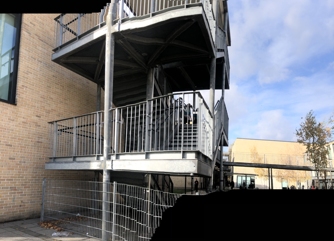
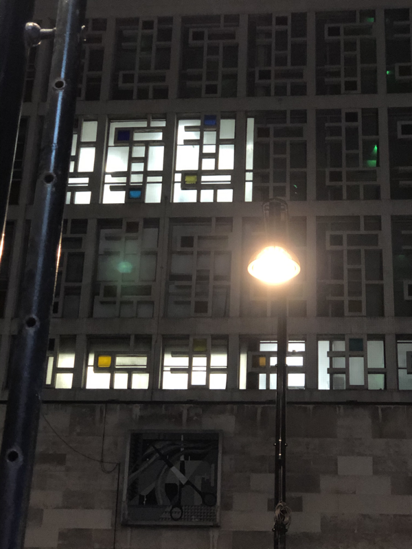
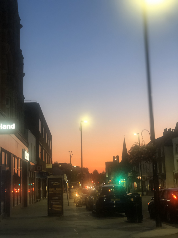
I took these photos outside of school. I tried to link all of my photos to shapes and different lines and I think that I done that well. all of them have very different focuses for example some are blurred but the out line of shapes are more bold where as others are not blurred and have loads of different lines and shapes to look at. one of the photos that I didn't like as much as the rest is the first blurred one, I feel like its to blurred so takes away the shapes and lines that are in the photo.
These are the second group of photos that I've taken with the app that I have on my phone. I think that these set of photos worked better than the other set of photos that I took. The reason I think these ones worked better is because I knew what I wanted to base my photos on which was the lines and shape of the buildings, which made it easier to find\photograph photos that looked effective. I think it would have been better if I use the app a little more by making the photos look 'wrong'. The next time I use that app I'm going to make it so that there isn't any people in the photo, as I think that they take away the whole concept of the photo.
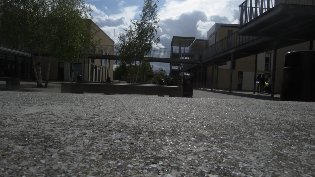
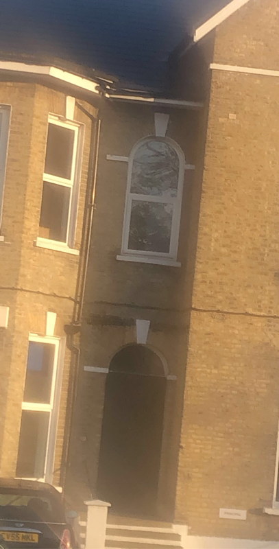
I took these photos outside of school without using the app that I normally use, most of them are blurred which makes then look better as it brings out the shapes\lines in the photo.
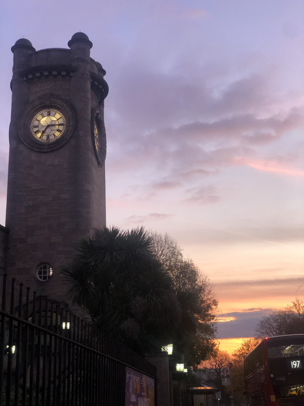
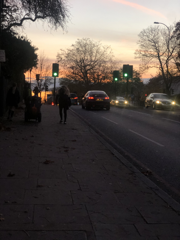
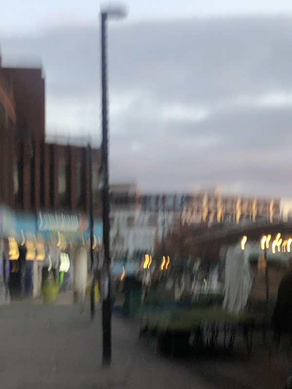
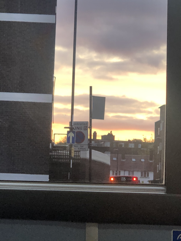
Photo used under Creative Commons from Brron
